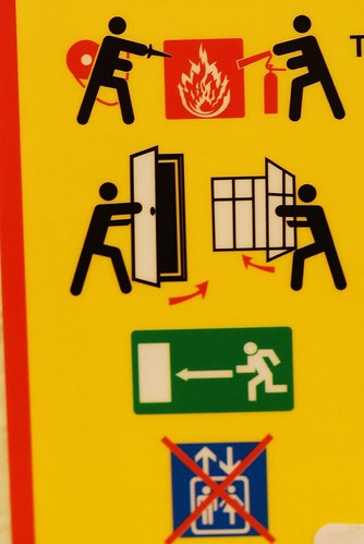
But this is an example of clear instructions. Clearly, it states that in the event of a small fire, attempt to extinguish it with a fire extinguisher. If not successful, close windows and doors and quickly make an escape. An elevator should not be used in event of a fire.
The images used are conventional stick figure diagrams that are easy to relate to. The simplicity in the scenarios make the point quick and clear. Which is a necessity in an emergency situation. There is not a single bit of clutter on this sign. Everything in it is necessary. Nothing extra.
The comic format is strange enough to catch the eyes of those nearby. An individual would have to be either busy or extremely boring to not be interested in a sign like this. This is a good thing because if a fire were to start, those inside would already know what to do, having been distracted by the sign at some time or another.
Visually, the colors used are all bright and lively. This adds to the interest factor of the sign. Additionally, it is primarily yellow, a color which the human eye is very sensitive to. The red indicates danger. In Japan, green is the color of the exit signs. In fact, the symbol used here is exactly the same as the true exit signs used. The colors all implicitly express something visually. Viewers are well informed with this sign around.
No comments:
Post a Comment