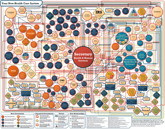
I guess I was confused on the final module one task. I thought that I had to upload one good and one bad comic book format. I have a bad one. But here is an example of a bad data graphics. I already presented, but here is a really confusing diagram of some sort. It is a flow chart having to do with health care. But there is just too much information packed into it. It is unappealing. There are too many arrows, labels, and the viewer doesn't know where to begin and end when looking at it. Simply unappealing.
No comments:
Post a Comment